top of page
CREATIVE DIRECTOR
BRAND IDENTITY, WEBSITE
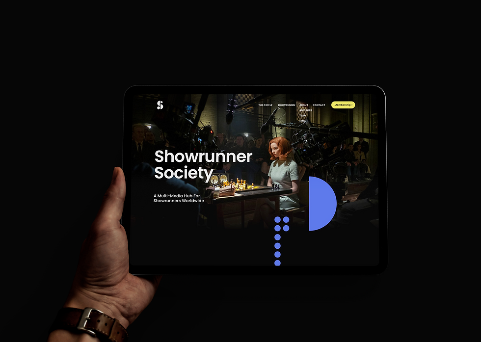
SHOWRUNNER SOCIETY
The Showrunner Society is a hub for experienced showrunners, a way for writers, directors, and producers to learn the craft of show running, and a place for industry executives to access a pool of talent. I was asked to design the brand identity and website design that will reflect their essence and relationship.
To see the website visit https://showrunner-society.eu

Logo Inception
Showrunning requires a strong foundation of building blocks and a diverse skillset to achieve the desired outcome. One does not work without the other—success relies on their harmony.
This logo concept embodies that philosophy: simple, memorable, and iconic. Geometric shapes form the letter "S," representing both Showrunners and society, symbolizing collaboration. The playful underlays evoke the dynamic process of learning and growth.
For a deeper understanding of the meaning behind the brand identity and Showrunners, visit their About page.
https://www.showrunner-society.eu/about


Brand visual research and logo
The concept of building blocks is not only iconic as a logo but also scalable, forming the foundation of a remarkable visual identity for the brand. To validate and refine this visual direction, I conducted thorough research across various channels. This research proved invaluable in helping the client's creative director confirm the chosen direction.


Brand identity: Refined colors, fonts and buttons
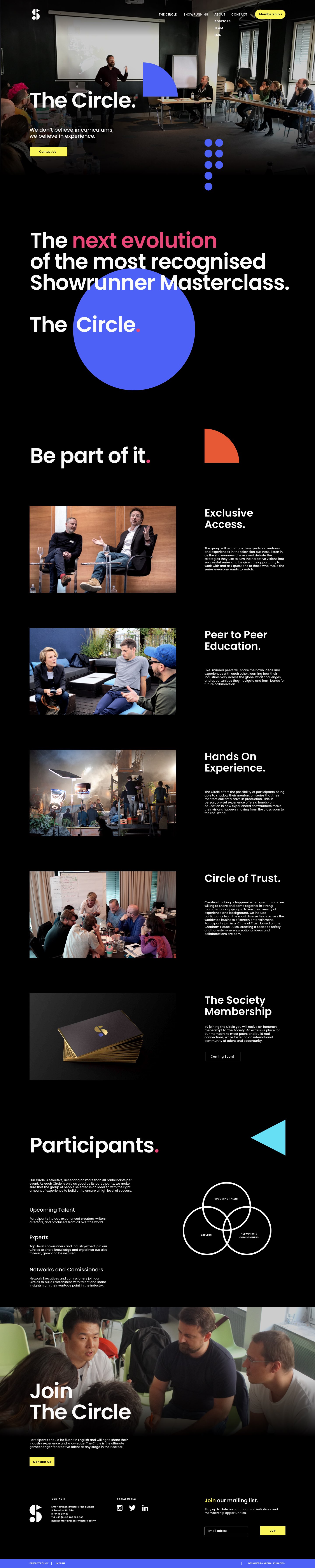
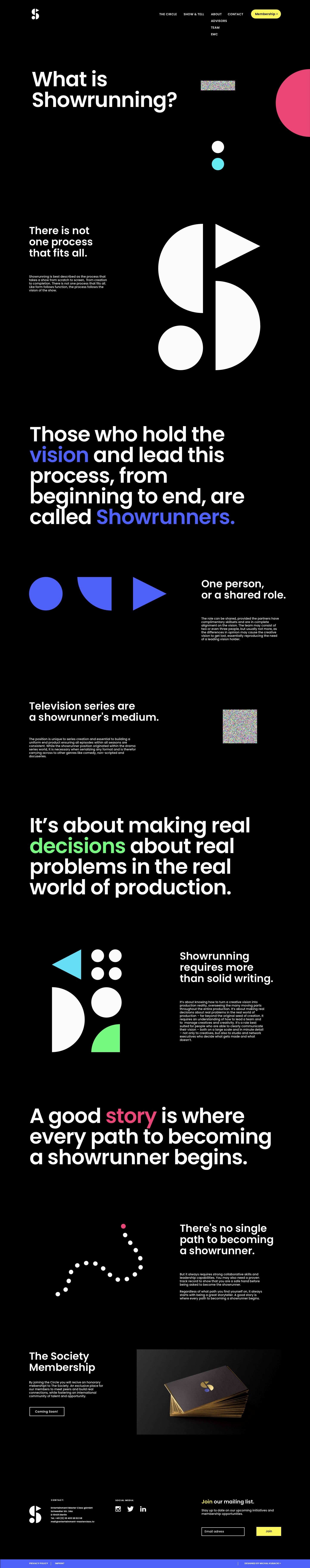
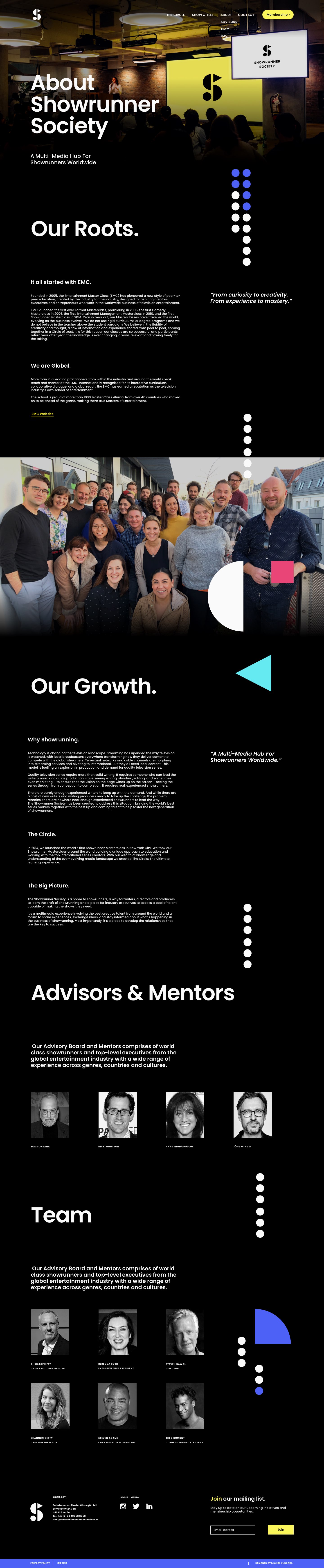
Brand identity is built upon three core elements: the logo, brand colors, and typography. The primary colors embody creativity and serve as the brand's most recognizable feature.
The secondary color, vivid and contrasting, is designed to capture attention as a call to action. Accent colors add a touch of playfulness, breaking the monotony. A black background evokes the immersive nature of cinema, while off-white typography ensures clarity and readability.
The chosen typography reflects the bold, geometric style of the logo. A thoughtful typographical hierarchy elevates the brand’s statements, presenting them with sophistication and unapologetic confidence.

Shapes
Just as with colors, graphic shapes bring dynamism to the brand identity, crafting engaging and unconventional visual layouts. These shapes are often integrated to enhance the text messaging, creating clever compositions that reflect the brand’s essence. To amplify the playful nature of the design, I incorporated TV noise patterns, further anchoring the brand in the world of television and cinema.

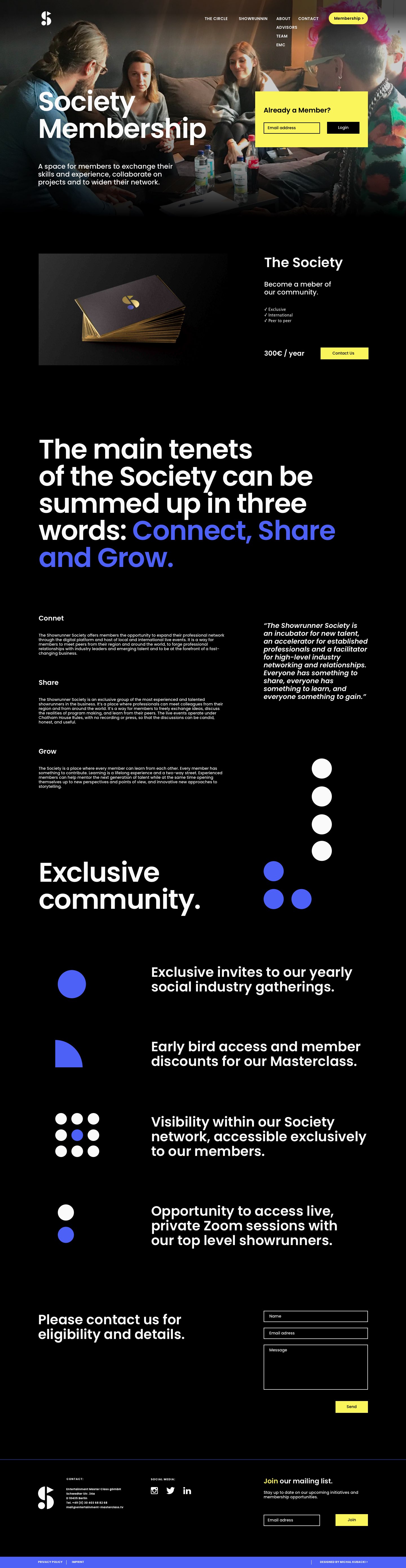
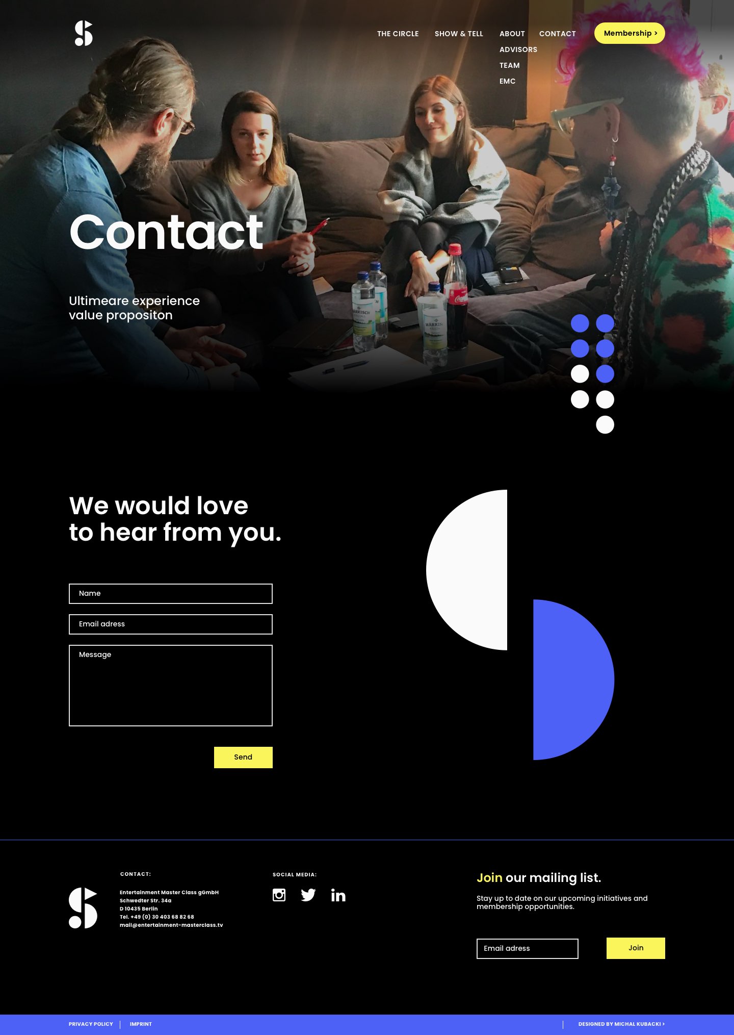
Web Design
The website is where all brand elements converge into a cohesive visual experience. Before diving into design, I collaborated with the client's Creative Director - Lee Getty to discuss the sitemap and specific modules, applying design thinking to define the who, why, how, and what of the website. Our goal was to solve a problem and achieve a clear outcome.
Starting with sketches, I quickly developed a homepage that we could iterate on. Once the homepage design was finalized, we knew it was scalable. The remaining pages were built using the same design modules, which allowed for greater efficiency in constructing subsequent pages.
In certain cases, I designed additional variants or modules to address specific needs.

Mobile Design
Right from the start of the brand identity design process, I prioritized a mobile-friendly approach, ensuring that the identity would be visually appealing and readable across all screen sizes. The visual design process mirrored that of a desktop page, with a focus on creating reusable modules that maintain their integrity on smaller screens. This adaptability ensures a seamless experience, regardless of device.


Desktop & Mobile Design Guidelines
Designing beautiful website mockups is one thing, but preparing a seamless handover to the client's developer is another. To ensure smooth implementation, I created comprehensive Desktop and Mobile UI Guidelines, focusing on sizing, safe space between modules (margins), and element spacing (padding). I also provided the universal grid settings used in designing the modules. This detailed handover minimized communication loops and streamlined the development process, ensuring efficiency and consistency.


bottom of page