top of page
CREATIVE DIRECTOR
WEBSITE
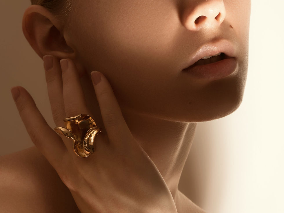
SOLAR GODESS
Solar Goddess is goddesses inspired jewellery in an online store. I was approached to propose how the store and product strategy could look.
Exploration
Solar goddess as a brand was undefined. In its inception, there was the idea that the brand has to be connected to light and somehow the idea of what goddesses and customers could wear. I started my research on defining a mood board that could portray the feeling of the brand. The collection of images ranged from depictions of the ancient goddess in sculpture, paintings, lions, deserts, sun beams, gold jewellery and images of potential customers as part of the image treatment. From this moment it was quite easy to define the colour pallet and potential images that work well with the product.


Brand concept
I was focusing on an e-commerce website that is brand awareness-driven. I decided to break down the collection represented by different types of goddesses. By expanding the universe of the brand I also motivate the potential design of the product lines themselves. Strategically this also opens marketing storytelling opportunities to target and segment customers that identify themselves with the particular goddess characteristic.


Collection page
Collection pages serve inspirational and educational purposes. Every collection starts with an image of the goddess and a description that explains the motivation for creating the collection. The next module features a product grid with mixed-up photos of images related to the goddess. This gives a more intentional look behind the collection and increases the perception of the product value.

Shop all page
Shop all pages serve to catalog the products. There are different types of user journeys for customers. Some of them already know something about the brand by coming from the homepage, other ones don't. Those who don't know the collection are briefly welcomed with a short description of what the store about and a quick navigation module leading to value-packed collection pages.
Font system
For their 2012 Spring/Summer collection, Dolce & Gabbana wanted to enhance the brand’s DNA and reflect their ‘Dolce Vita and Italian cinema era inspired’, advertising campaign. We created a fully flash website using images shot in Southern Italy with a special focus on family. When landing on the website, it was important to immediately get the look and feel of the luxurious Sicilian lifestyle and environment. To evoke this, I contrasted the product gallery with images and animated backgrounds of nature and Italian architecture.

Product description page
Product details pages serve as a clean expose of products. Here it's all about detailed images of the product. What was important is to present the MVP version of the page.

bottom of page